AHMY Agency Website Redesign
I redesigned a Los Angeles creative marketing agency website into a more premium, editorial, image-led experience.
The context
AHMY Agency already had a strong visual direction, but the old website did not fully express it. The page felt too plain, the layout was not curated enough, and the content did not have a clear visual rhythm. My task was to redesign the experience so the website felt closer to the agency's actual world: premium, visual, editorial, and confident.
The challenge
Create a stronger visual hierarchy
Make the layout feel curated instead of mixed together
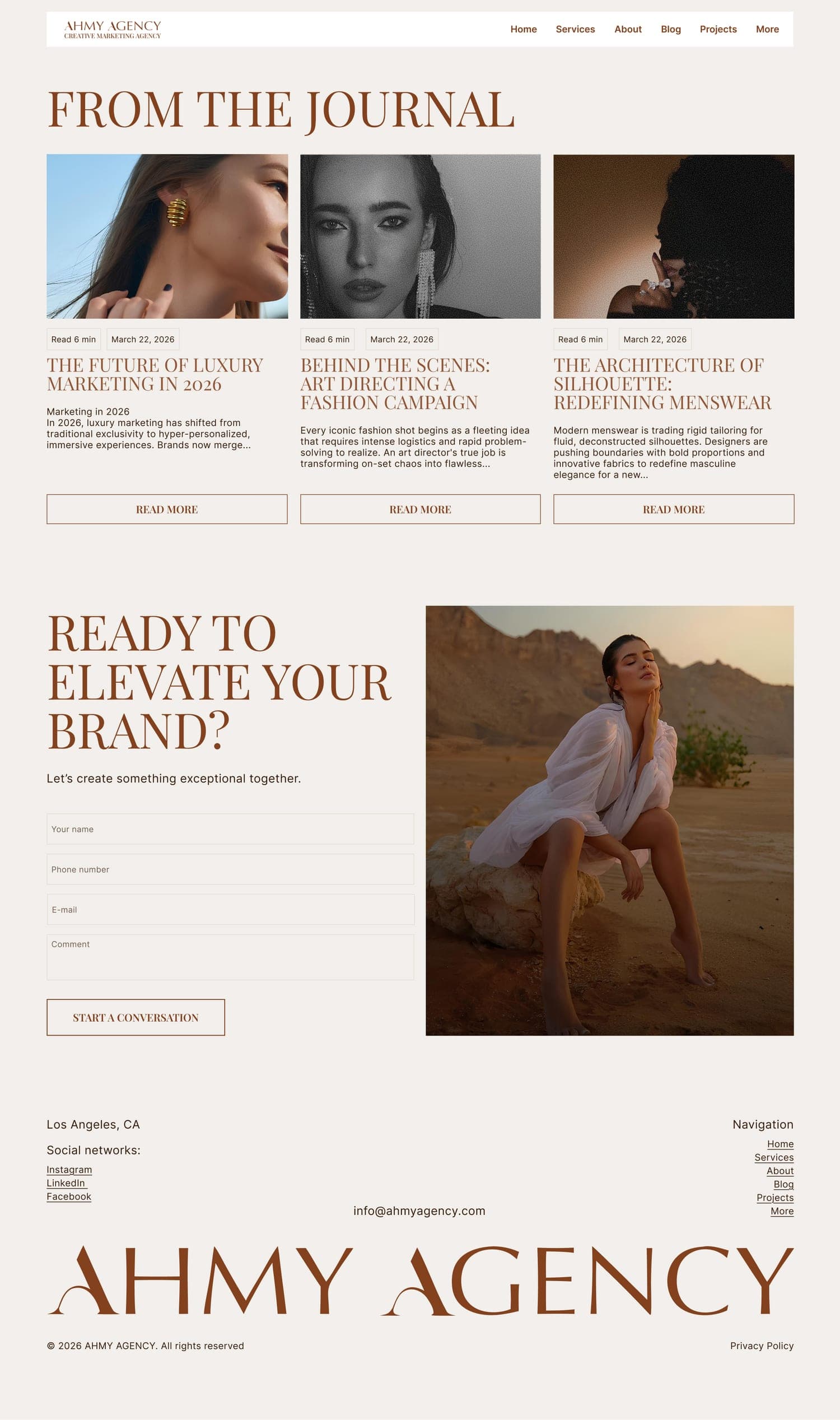
Let the imagery become the main storytelling tool
The biggest challenge was not to add more decoration. It was to make the page feel more intentional. I needed to use fewer elements, stronger spacing, better composition, and a more focused visual rhythm.
Design direction
I built the redesign around a warm, luxury-inspired palette, large editorial imagery, high-contrast typography, and spacious sections. The website uses text carefully: not as filler, but as part of the composition. The goal was for each block to feel like a curated visual statement.
Visual system
The visual system is built around contrast: large type against quiet space, cinematic imagery against minimal copy, and structured grids against expressive photography. This helped the website feel premium without making it overloaded.
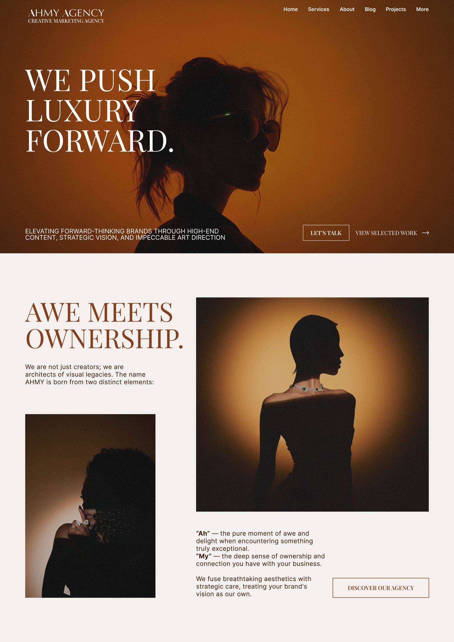
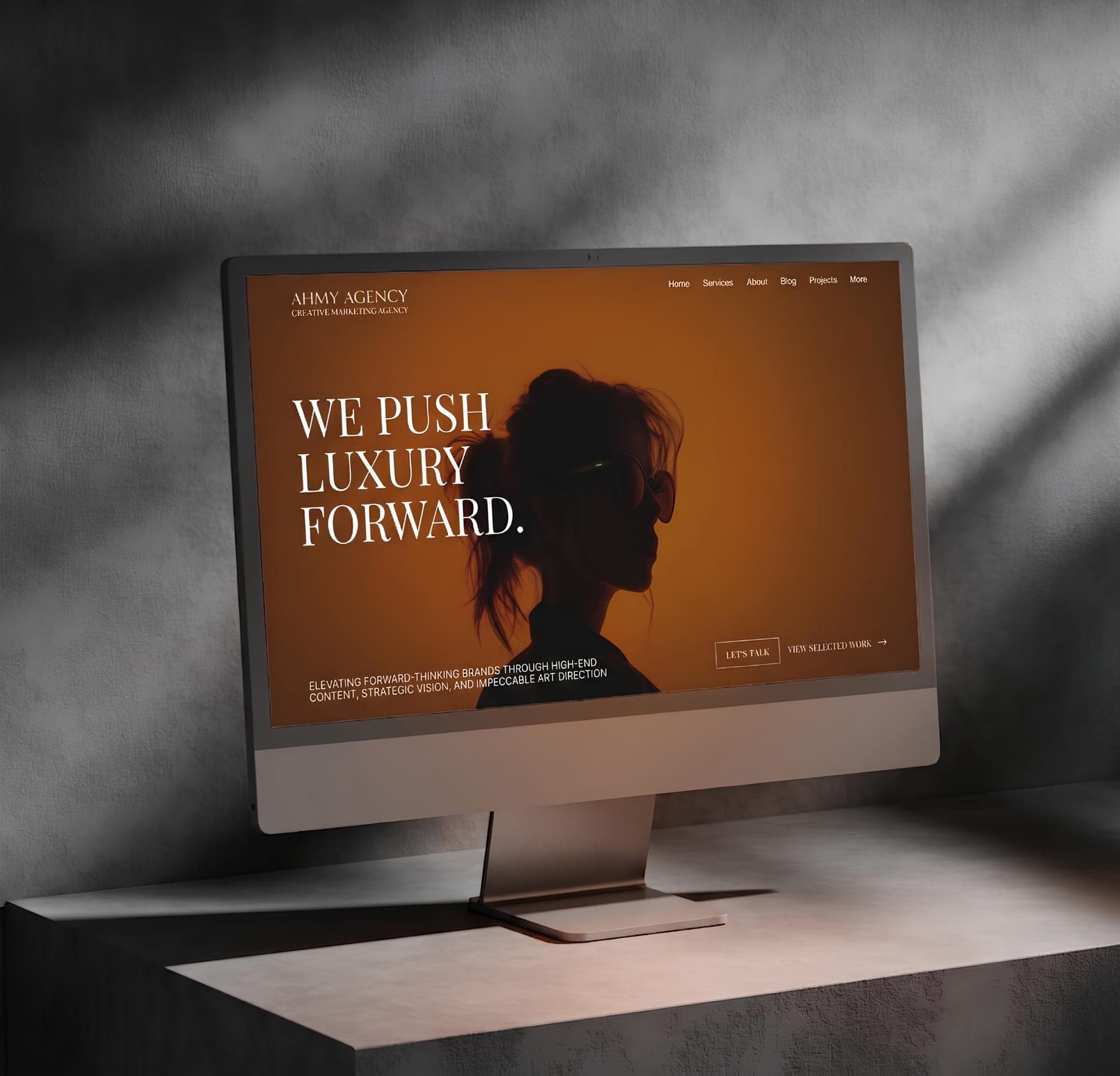
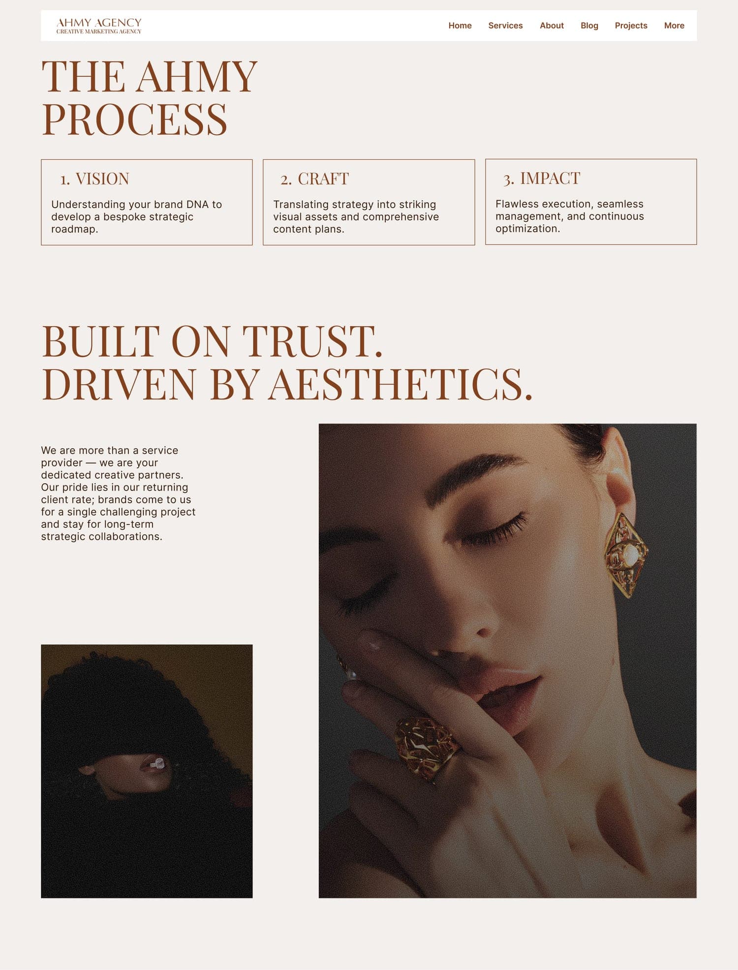
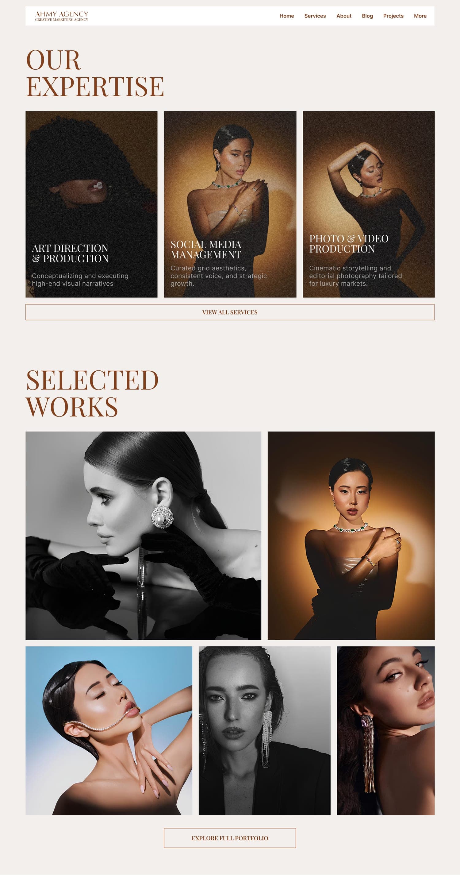
Key screens
The outcome
The final redesign gave AHMY Agency a more distinctive and premium web presence. The layout became more focused, the imagery had room to lead the experience, and the text started working as part of the visual system rather than sitting on the page as filler. The redesign was received very positively by the client, and it created a clearer foundation for the agency's digital presence.
What I focused on
Composition
Balancing imagery, type, and space into deliberate, curated layouts.
Visual hierarchy
Guiding the eye so the most important things read first.
Editorial rhythm
Alternating full-width and split sections to keep a magazine-like pace.
Premium brand feeling
Warm tones and restraint that signal quality before a word is read.
Image-led storytelling
Letting the agency's photography carry the message.
Need a website with stronger visual direction?
I can help turn a flat or unfocused website into a clearer, more premium experience.