TSA Kazan — Transport Outsourcing Website
I redesigned a complex B2B transport outsourcing website into a clearer, more structured and conversion-focused experience.
The context
TSA Kazan works in a complex B2B category: transport outsourcing, freight forwarding and operational support for enterprises. The old website did not explain the offer clearly enough. The structure was harder to navigate, the visual system felt weak, and the key service paths were not obvious enough for a business client who needed to quickly understand what the company could take over.
The challenge
Explain a complex B2B service quickly
Separate two main service directions
Build trust without overloading the page
The main challenge was to make the website feel simple without making the service look small. I needed to structure a broad transport offer into clear sections, guide users toward the right request path, and create enough visual density so the site felt confident and complete.
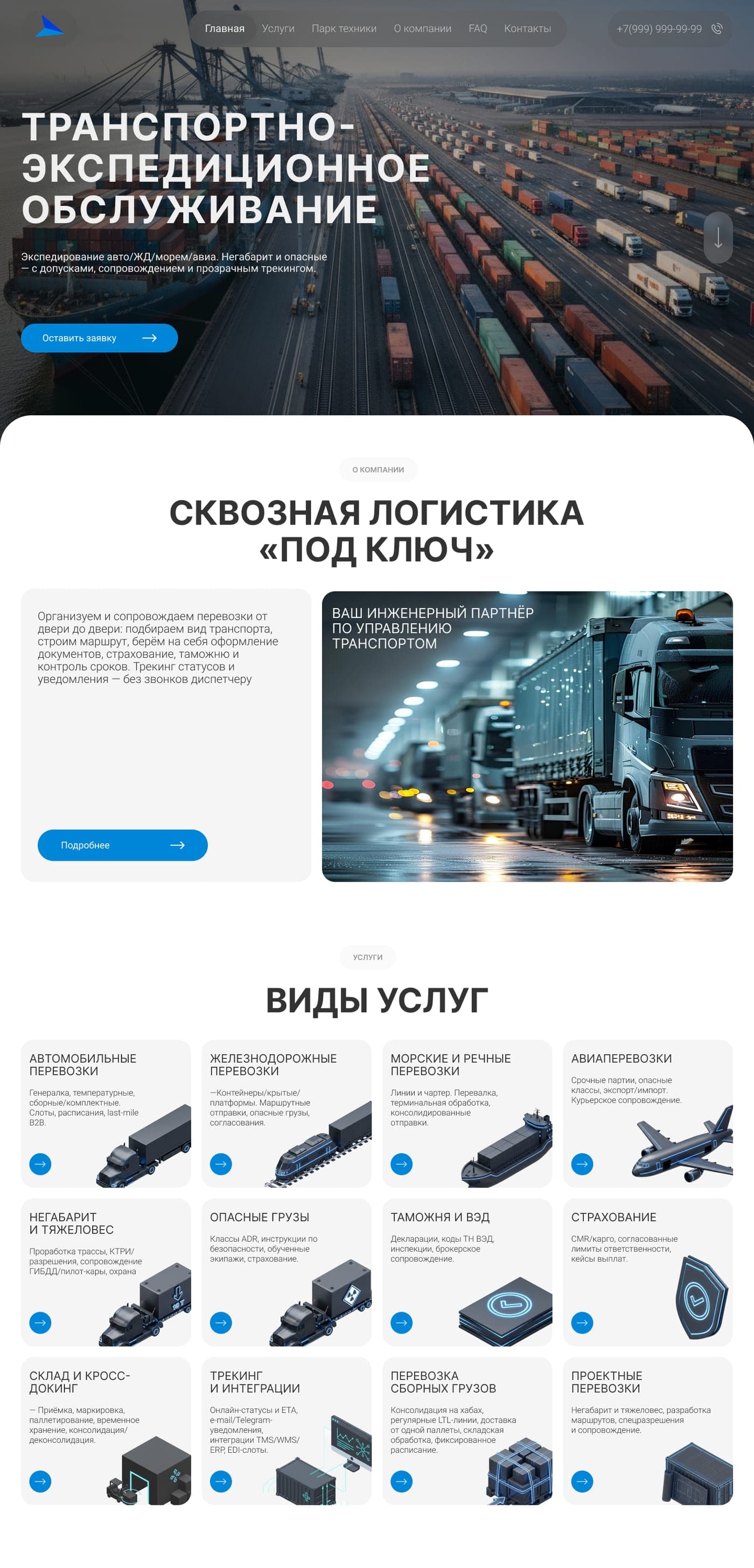
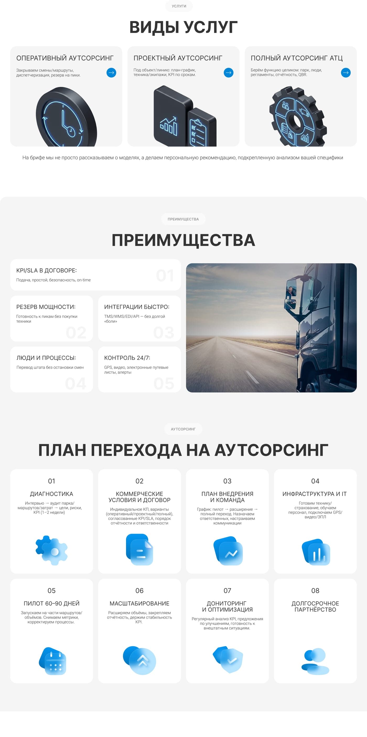
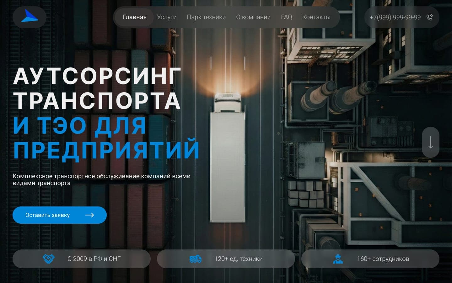
UX structure
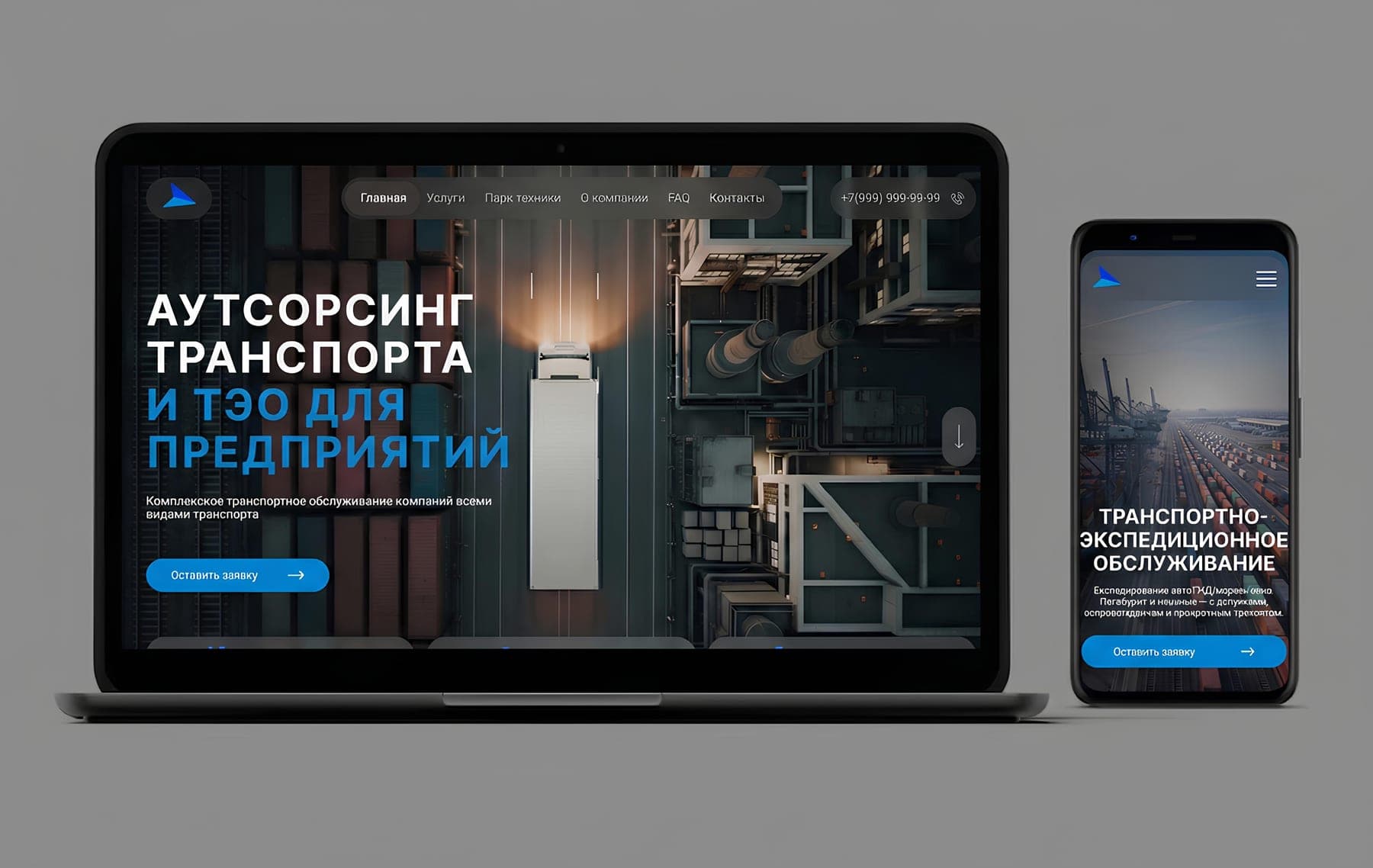
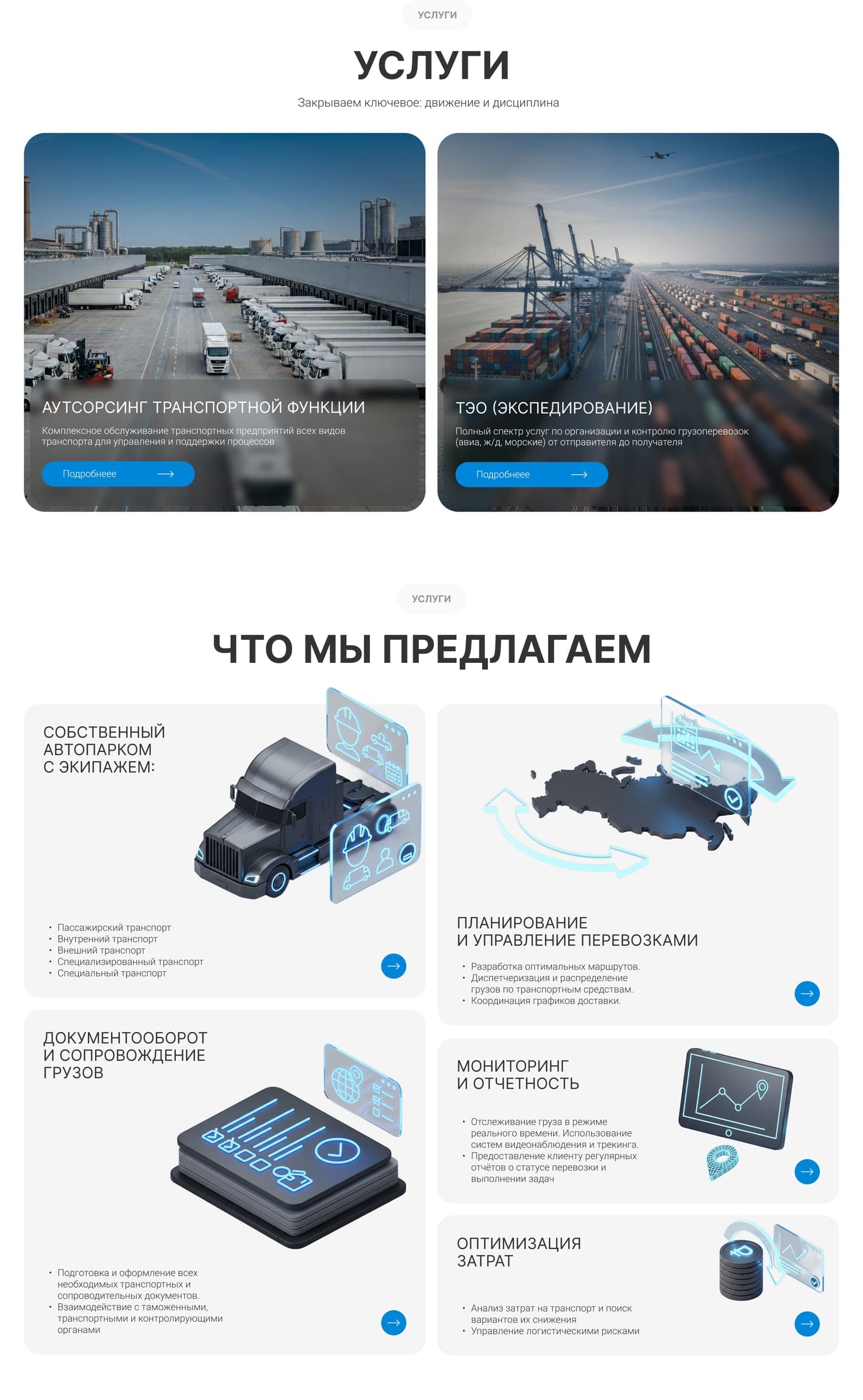
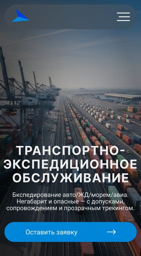
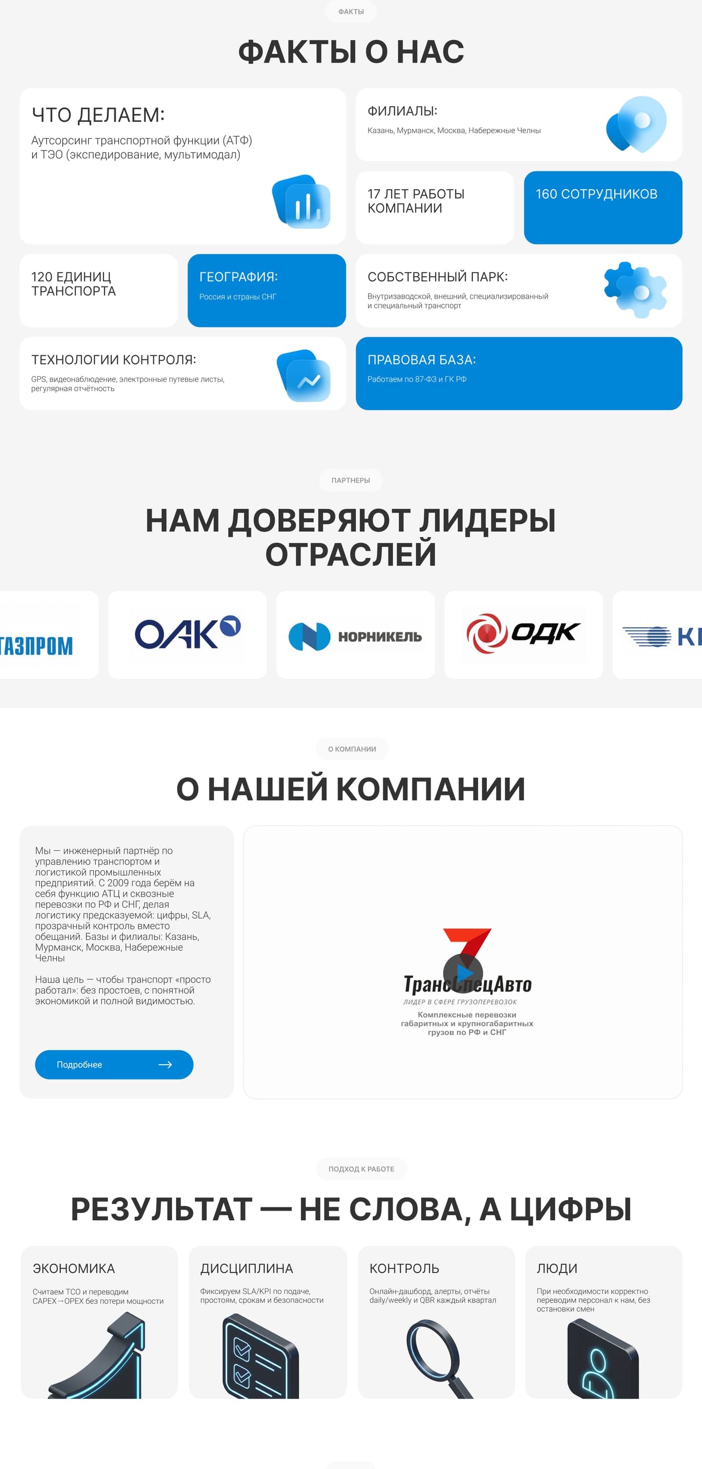
I focused on separating the offer into understandable layers. The first screen explains the core value, the next sections introduce the company and the main service categories, and deeper blocks guide users into transport outsourcing, freight forwarding, fleet-related services, facts, FAQ and request points.
- Clear hero message
- Visible CTA
- Clear, steady navigation
- Two main service paths
- Service cards with direct actions
- FAQ for B2B objections
- Separate mobile flow
- Request CTAs where intent is highest
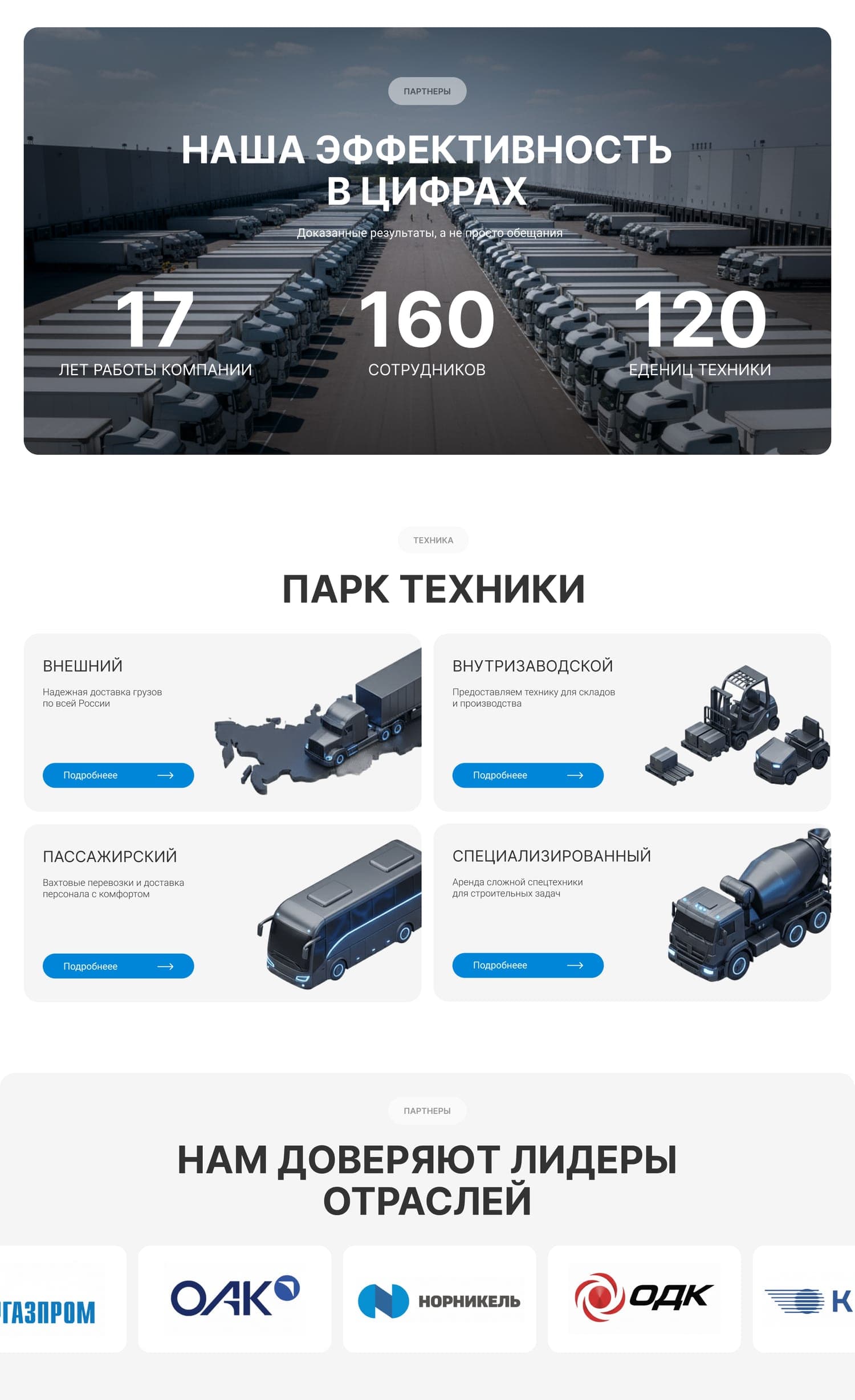
AI-assisted visual system
The transport outsourcing category does not always have enough unique visual material. To avoid a generic stock-photo website, I directed a set of AI-generated 3D icons in one consistent style. These icons helped fill the interface with useful visual cues, made service cards easier to scan, and gave the website a more recognizable visual language.
- AI-generated icon set
- Unified 3D style
- Blue accent glow
- Used across services, facts and process
- Support scanning and comprehension
- Not decoration only
Visual direction
For the visual direction, I kept the interface clean and functional. The website uses a cool blue accent, large transport imagery, rounded cards, clear section titles and calm spacing. The goal was to make the company feel reliable, modern and operationally strong — not flashy for the sake of being flashy.
Implementation supervision
The implementation was done under my supervision. I paid attention to how the design translated into the final interface: spacing, responsive behavior, animation rhythm, transitions, hover states and the way request points worked across the page. I designed this project during my art direction role at BOK Agency, where I was responsible for the design direction and visual quality of the work.
Key screens
The outcome
The redesign gave TSA Kazan a clearer and more modern B2B website. The offer became easier to understand, the two main service directions were easier to navigate, and the AI-assisted icon system helped the site feel more complete and recognizable. After launch, the new website showed an approximately 40% conversion increase compared to the previous version.
What I focused on
B2B UX clarity
Making a broad, complex service easy to understand at a glance.
Service architecture
Structuring the offer around two clear service directions.
AI-assisted icon system
Directing a consistent AI-generated 3D icon set for the interface.
Conversion-focused CTAs
Placing request points where business intent is highest.
Implementation quality
Supervising spacing, responsiveness and transitions to launch.
Need to make a complex B2B service easier to understand?
I can help turn a complicated offer into a clearer website with stronger structure, visuals and conversion paths.